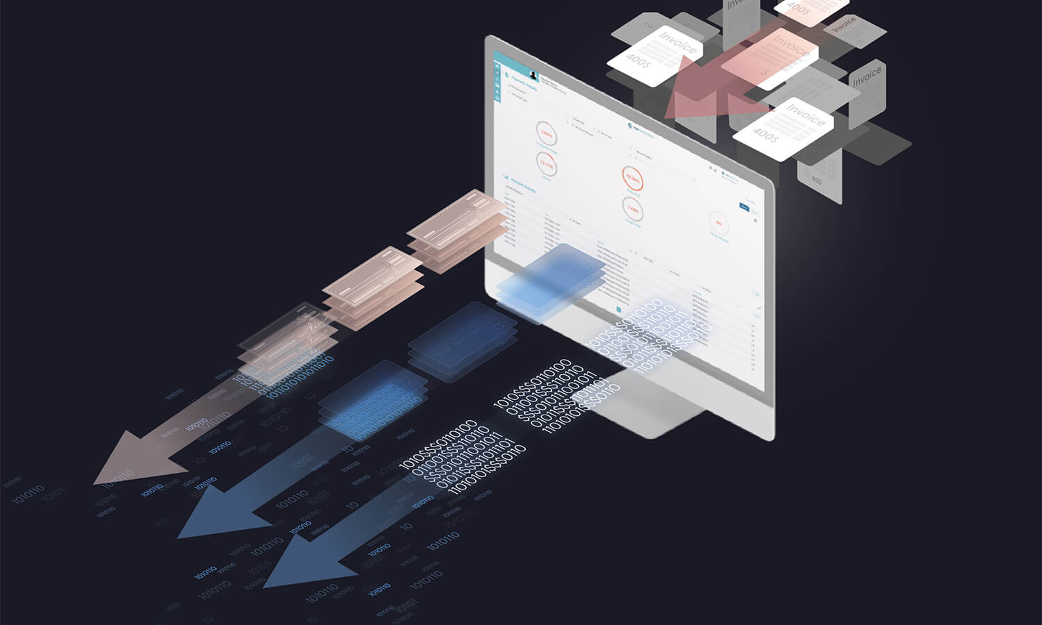
Corporate Spending Innovations is focused on defining and building the future of payments. We needed a brand that reflects our mission. As you explore our new website, you may have noticed some big design changes. Each design decision was made to reinforce our strategic goals and represent our tactics to make them happen.
Our Goals:
1. Operate Globally
Almost three decades ago, Corporate Spending Innovations first established itself in North America with fleet cards. Since then, our roots have grown deeper and our footprint across the continent has grown wider. We built new solutions to service new industries and unlocked opportunities in new territories.
Our new brand’s illustration style articulates the breadth of company types that lean on our payments solutions to power their businesses.

Several years ago, Corporate Spending Innovations joined the Edenred family. With Edenred’s deep reach across Europe and South America, we’re poised to expand our impact, delivering our solutions to the increasing number of companies that operate internationally, where making fluid payments across borders is table stakes.
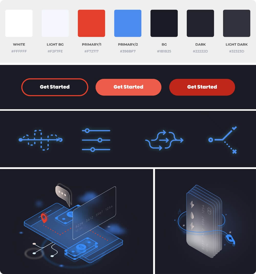
We chose to emulate the Edenred palette, while modifying the mix of tones to keep our look distinct. With its dark blue base, this palette delivers an underlying sense of stability. With its pops of cobalt blue, this palette feels future-forward. With its pops of red, the palette suggests immediacy. Our visual nod to our parent company’s brand encapsulates our joint ambitions to expand worldwide, to wherever business payments are made.
The world’s business environment changes daily. It’s shifting, complex, and requires solutions that can respond to those twists and turns. In a word, it’s dynamic. Across our brand – and on our site – we’ll use animation and motion to visualize our company’s ability to match (and exceed) the speed of the shifts in the world’s corporate payments landscape.
2. Set the Future of Payments
There’s a saying in hockey that you want to skate to where the puck will be, not where it is. Setting the future in business is the same way. You have to take a bold stance, moving with conviction to where you think the future will be. You have to be light on your feet, always in motion – dynamic – to make quick pivots. You have to act on instinct, a reflex that’s built through years of practice.
Our brand’s bold, dark tones represent our definitive moves towards the future, our conviction about where things are heading in the corporate payments space.
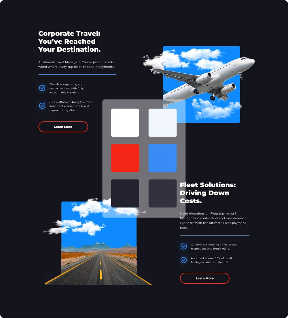
Our dynamism comes to life through the animations on our site. Illustrations move, collages come to life, objects flow as you scroll. Our website is always in motion, ready to respond to user actions.
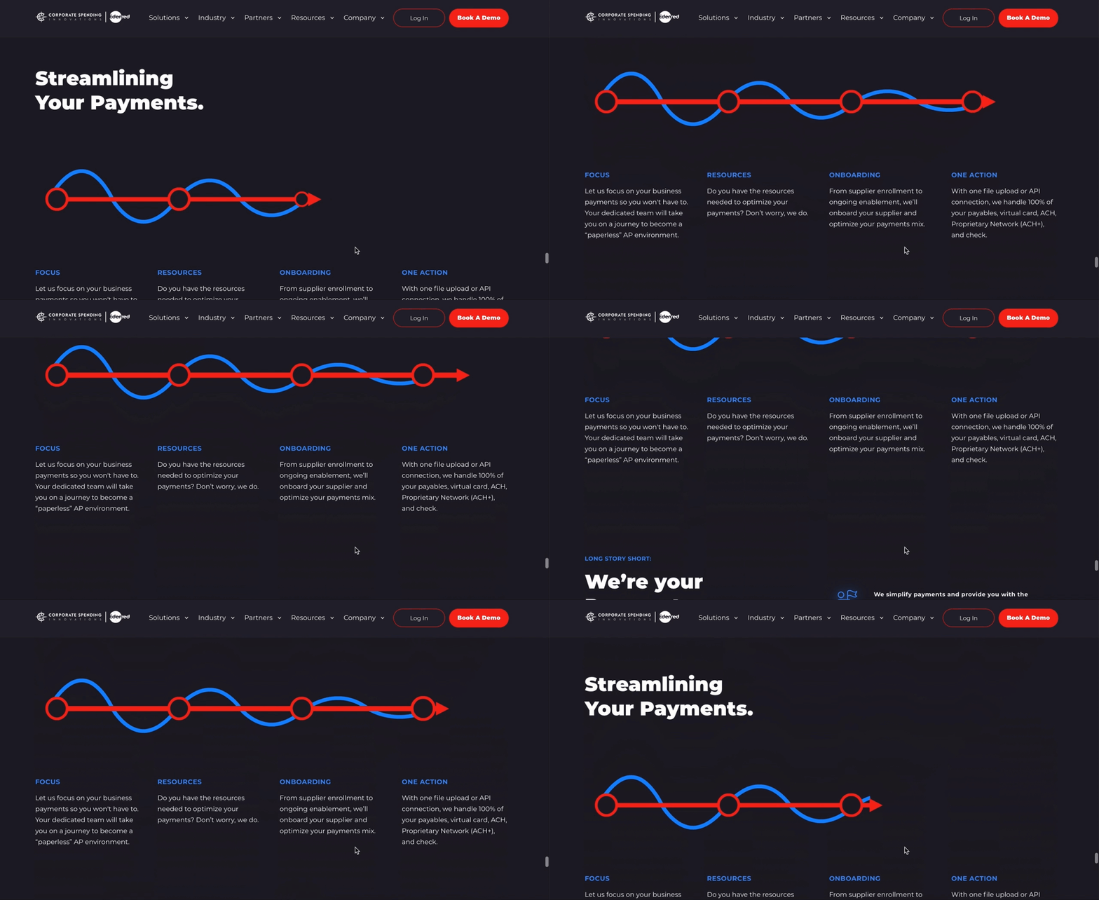
Our solutions empower teams to meet and help define the future with us. We make teams faster and better through the use of automated processes and actions. Our website – and brand system – is a study in automated actions. As you scroll, you are triggering additional features and content sections to spark to life. Small user decisions deliver multiple actions.
3. Deliver a Tailored Experience
Every business is different. And, so are their payment needs. We’ve spent decades building a suite of solutions that, through the right mix, provide a tailored solution for each of our customers. Our new website and brand system demonstrate this commitment to tailored experiences through our suite of offerings.
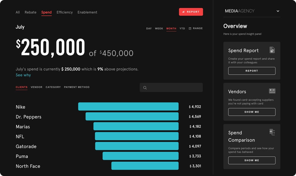
In 2020, we launched our CFO Dashboard product. This next-generation performance monitoring tool reinvented the look and feel of our digital products. Now, we’re building our site to speak to that forward-looking UX / UI, unifying the experience of our digital products, even if their purpose solves specific industries and use cases.
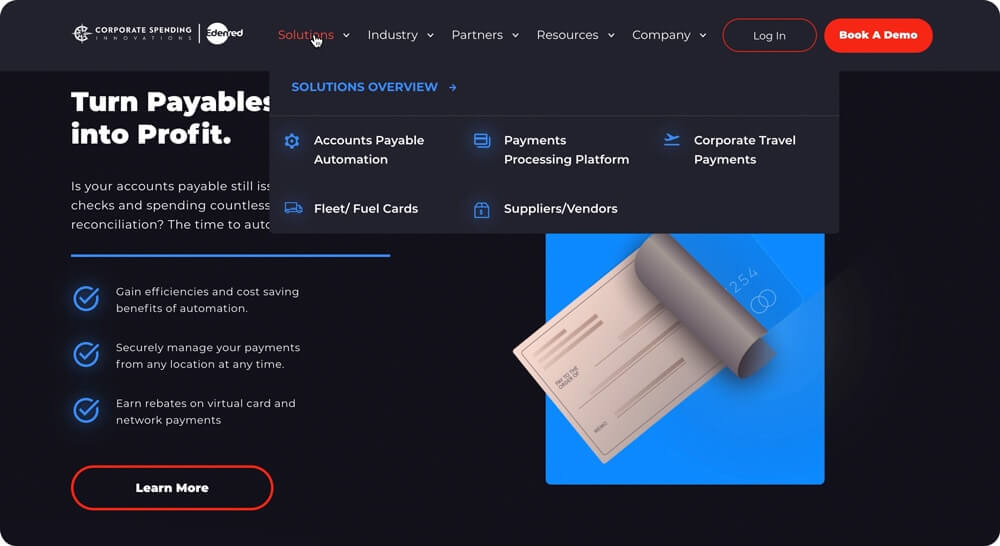
To create a tailored solution from a suite of offerings, one needs to see what all is on offer. We made sure that every visitor to our site – regardless of industry – is easily able to explore the various products that make up the full line from Corporate Spending Innovations. Our deep, mega-navigation acts as a menu of services, from which a tailor-made, customer-specific solution can be built.
What’s Next?
We’re doubling-down on our mission to define and build the future of payments. With our new website and brand in place to better reflect our goals, our team (with ongoing feedback from our customers) is crafting product improvements to solve tomorrow’s challenges.
We hope you like our new look. It’s the one we’ll be showing to the world as we boldly press forward to automate, streamline, and improve the payments processes of every size business, across every industry, in every part of the world.
